See Big Data In Action!!!
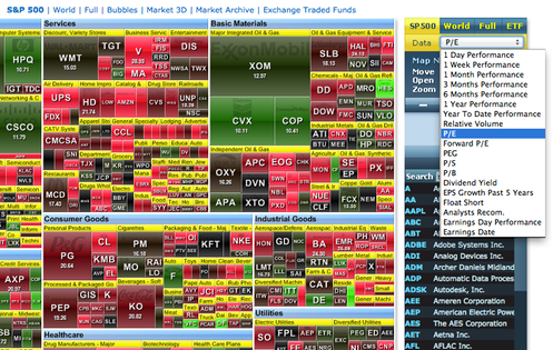
This stock analysis tool is an example of how visual analytics present Big Data. All S&P 500 stock data is considered within prescribed periods of time (one day, one week, one month, three months, six months, one year, or year-to-date). The tool allows the comparison of P/E (Price-Earnings Ratios), P/S (Price-Sales Ratio), P/B (Price-Book Value Ratio), Dividend Yield, EPS (Earnings Per Share), Float Short, Analysts Recommendations, Earnings Announcement Day Perfromance).
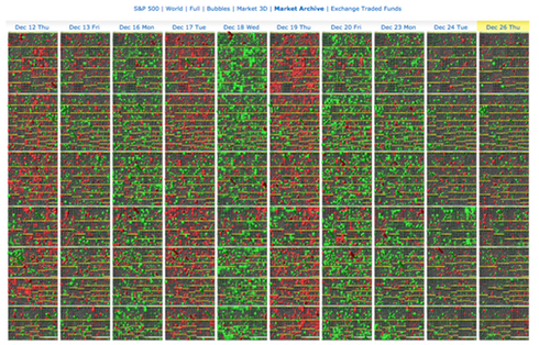
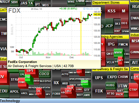
Not impressed with this quantity of data, how about visualizing more than one day at a time.
Still not impressed, OK how about visualizing price changes in 3D with pop-ups showing greater detail.
StockChart.com Market "Carpets" #2
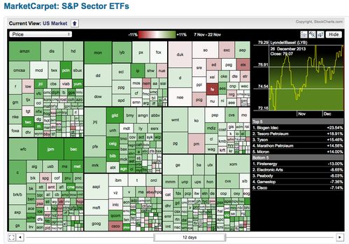
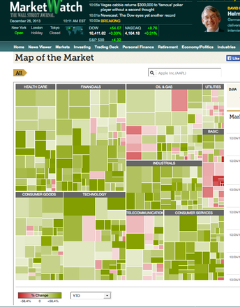
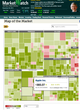
StockChart.Com Explains Market Carpets
StockChart.com's Interactive MarketCarpetTM tool lets you see "at-a-glance" what the entire market is doing. The performance of individual sectors and securities is easily determined in this organized method of charting. Here, individual stocks are represented as squares that are colored on a green to red spectrum. With the standard color scheme, the green stocks are performing relatively well and the red stocks are performing relatively poorly. In this way, market carpets can show a lot of information in a condensed area, for you do not need more space to represent a stronger security, rather you need just a darker green. A side bar on the right allows you to view the performance of a stock or sector on a line chart. Likewise, it displays the best and worst performers from the group you have selected.